I've been waiting for SIA to "fix" KrisWorld, but last I flew it was still the same. Maybe one day. Do let me know if you see a new layout on any of their flights!
But it had me thinking, and I thought worth discussing because it seems a good example of how marketing-driven design changes can have unintended usability consequences despite everyone's best intentions.
Don't get me wrong, SIA remains my favourite airline of all, but it is disheartening to see that even the best airline in the world is susceptible to getting stuck with "bad design". Makes you wonder if there is any hope for the rest of us.
My gripe is with the layout of the CD selections.
How do you select an album you might want to listen to?
- You might recognise the album cover
- Maybe you like certain artists, but not know the specific albums available
- Or you might be looking for a certain album title
- And for some, you don't recognise the album art, title or artist but are attracted to sample it because of the genre or the cover
When looking through a long list of albums, chances are that all of these methods of recognition and selection are at play.
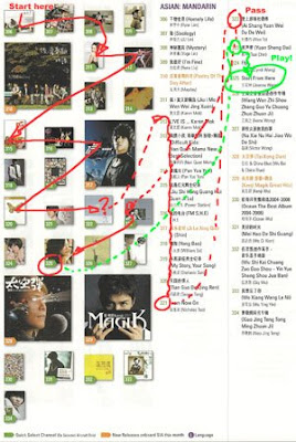
The trouble with KrisWorld is that they have separated the album cover display from the listing of artist and album name. The only thing that links them is the artificial numeric code that is applied to each.
 On the left is an approximation of my actual scan pattern when trying to make a selection.
First I scan the album covers. Many I don't recognise and skip over.
I find something I think I recognise. To be sure, I then cross-reference into the album list and start another search using the special code number.
At this point I'm wondering if eye exercises are a safety feature designed to prevent DVT, or just intended to make the flight pass more quickly.
 Maybe Joanne Wang is a little too sedate for how I'm feeling now, so I start another search through the album/artist list.
Down we go. Some I recognise (but without the album cover I'm not 100% sure).
Ahah, Wu Bai. That's more like it. But which album is this? Cripes, time to find the matching album cover to make sure.
Finally. Time to listen. A good thing this is CD and not a movie, because my eyes need a rest now..
Why do I need to work so hard? How to solve this usability nightmare?
Well, one suggestion is to just keep it simple. Cover art, album title, and artist are bits of information that both separately and in combination help me search the listings the most effective way. So just put it all together in the list. For example:

The eliminates all cross-referenced look-ups, is simple and direct, and does not require significantly more space. Best of all, as a "user" it is effortless.
Funny ... isn't this exactly how the layout used to be designed?
The lesson? Sometimes, designs must be seen to change for marketing or other business reasons, letting you loose in a requirements vacuum. The danger is that in the absence of specific functional or usability needs, other factors such as aesthetics and branding will expand to fill the void. Done carelessly, you can inflict untold collateral damage on the product through the process.
The solution? Consciously re-introduce at least a usability/functional benchmark into the design process - "be no worse than it was before". Better yet, ensure usability improvements remain a key objective - no matter how good you might think it was before, perfection is always one better.
And yes, usability applies as much to the printed page as it does to the web!


No comments:
Post a Comment